
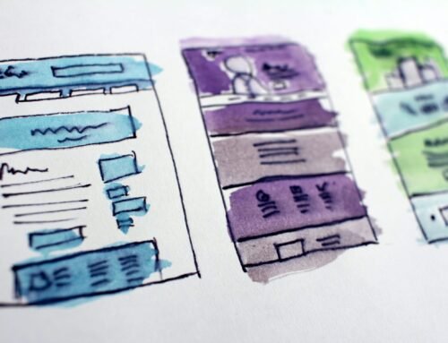
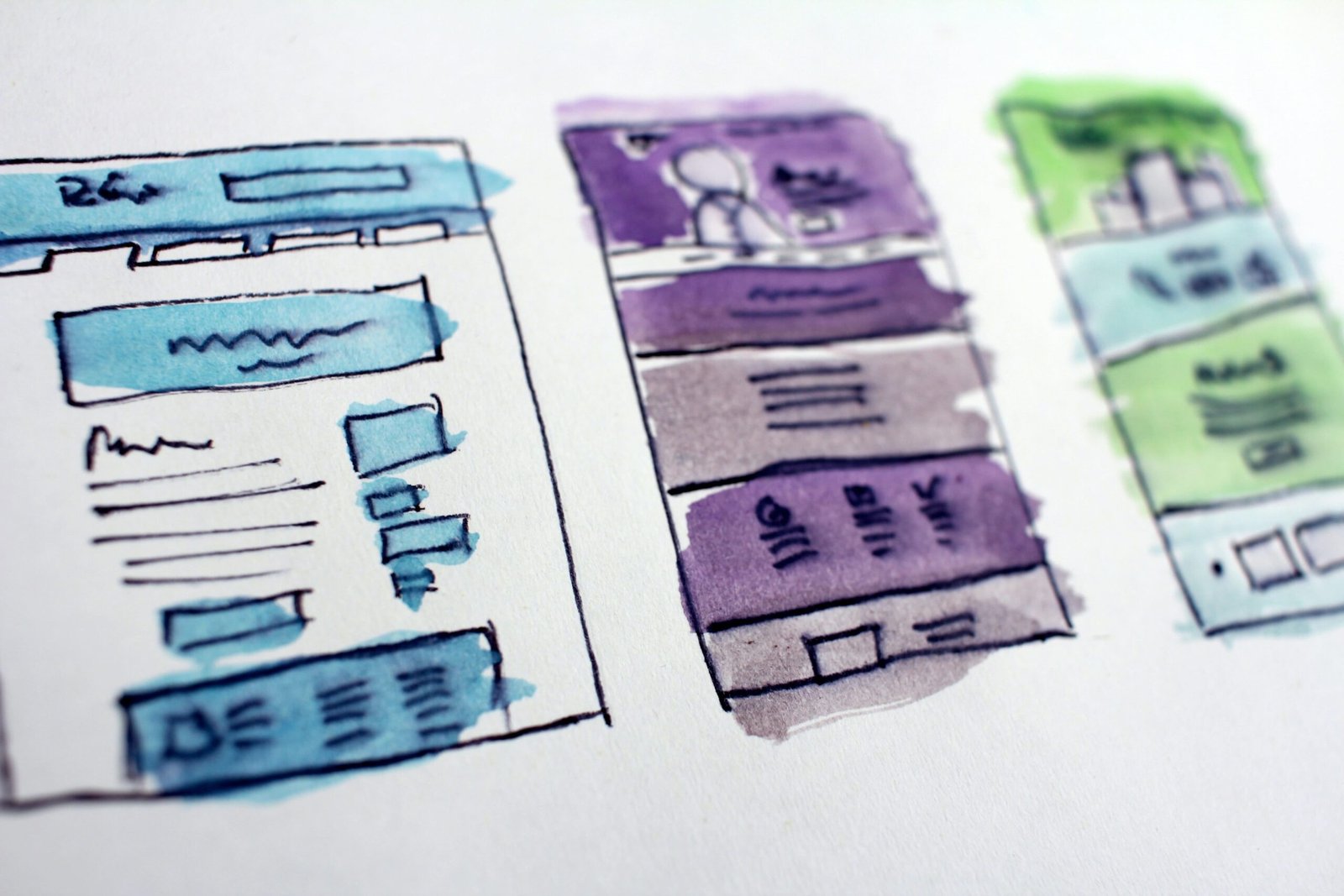
Do you wish to enhance your website’s SEO and user experience? If so, you need to consider using a responsive design. Responsive design is a web design approach that makes websites adapt to the size of the device they are being viewed on.https://indiadigitalagency.com/benefits-of-using-wordpress-over-any-other-cms/ This means that your website will look great and be easy to use, whether it is being viewed on a desktop computer, laptop, tablet, or smartphone.
In this blog post, we will discuss the importance of responsive design for SEO and user experience. We will also provide some tips on how to create a responsive design website.
The Importance of Responsive Design for SEO
There are many benefits of using responsive design for SEO. Here are a few vital ones:
- Improved ranking in search engine results pages (SERPs): Google and other search engines now favor websites that are responsive. This means that your website is more likely to rank higher in SERPs if it is responsive.
- Increased traffic from mobile devices: More and more people are using their mobile devices to access the internet.https://www.smashingmagazine.com/2011/01/guidelines-for-responsive-web-design/ A responsive design will ensure that your website is accessible to these users, which can lead to increased traffic.
- Improved user experience: A responsive design provides a better user experience for everyone, regardless of the device they are using. This can result in increased engagement and conversion rates.
The Importance of Responsive Design for User Experience
In addition to the benefits of SEO, responsive design also has many benefits for user experience. Here are some of the most important ones:
Improved readability: Text and images are easier to read on a responsive design website, even on small screens.
Enhanced navigation: The navigation menu is easy to find and use on a responsive design website, even on small screens.
Smooth scrolling: Scrolling is smooth and fluid on a responsive design website, even on small screens.
Reduced zooming and panning: Users do not have to zoom in and out or pan around to see the content on a responsive design website.
Improved overall user experience: A responsive design website provides a better overall user experience for everyone, which can lead to increased satisfaction and loyalty.
How to Create a Responsive Design Website
There are a few things you need to do to create a responsive design website:
- Use a responsive design template or framework.
- Use responsive images and videos.
- Optimize your website’s code.]
- Test your website on different devices.
There are many responsive design templates and frameworks available. Some of the most popular ones include Bootstrap, Foundation, and Materialize.
When choosing a responsive design template or framework, it is important to choose one that is well-coded and easy to use. You should also make sure that the template or framework is compatible with the content management system (CMS) you are using.
Responsive images and videos are important for improving the user experience on mobile devices. When resizing images and videos for mobile devices, it is important to maintain their quality.
You can optimize your website’s code by using a magnifier to remove unnecessary code and by using a caching plugin to store static files on the server.
Finally, it is important to test your website on different devices to make sure that it looks and functions properly. You can use a tool like Browser Stack to test your website on a variety of devices and browsers.
Conclusion
Responsive design is an important consideration for any website owner who wants to improve their SEO and user experience. By following the tips in this blog post, you can create a responsive design website that will help you attract more traffic and improve your conversion rates.
IDA is a leading SEO and web design company that can help you create a responsive design website. We have a team of experienced professionals who can help you every step of the way, from choosing a responsive design template to testing your website on different devices.
Contact IDA today to learn more about how we can help you create a responsive design website that will improve your SEO and user experience.
Here are some additional tips for creating a responsive design website:
- Use clear and concise navigation.
- Use high-quality images and videos.
- Make sure your website is mobile-friendly.
- Use a responsive design testing tool.
- Keep your website up to date.

